Monitor faults with MicroProfile Fault Tolerance 1.1

All applications need to deal with unexpected problems, whether it’s an important service being unavailable or a sudden influx of requests which could overload your application. MicroProfile Fault Tolerance provides annotations which allow you to easily apply common fault mitigation strategies to your application but did you know that, since version 1.1, it also exports metrics which allow you to monitor these mitigation strategies?
The full details of the metrics are in the Fault Tolerance 1.1 spec but here’s a quick overview:
-
If you use
@Retry, metrics are added for how often your method is failing and being retried. -
If you use
@Timeout, metrics are added for how long calls to your method are taking and how often they’re timing out. -
If you use
@CircuitBreaker, metrics are added to track what state the CircuitBreaker is in, how often your method fails, and how often an open circuit breaker causes your method to fail without being run. -
If you use
@Bulkhead, metrics are added for how many concurrent calls to your method are currently executing, how often calls are rejected, how long calls take to return, and how long they spend queued (if you’re also using@Asynchronous). -
If you use
@Fallback, metrics are added for how often your method falls back to its fallback handler or fallback method. -
If you use any of the above annotations, metrics are added for how often your method ultimately returns an exception to the caller after all of the fault tolerance processing has finished.
In general, the idea is that if you’re worried about your method failing in a certain way and are using fault tolerance to try to mitigate that, metrics are added so that you can easily monitor whether or not your application is actually failing there.
MicroProfile Fault Tolerance 1.1 is included in Open Liberty 18.0.0.3 and above.
To learn more about what you can do with MicroProfile Fault Tolerance, see:
Gathering metrics from Liberty with Prometheus
-
Clone this sample app which uses MicroProfile Fault Tolerance and deploys to an Open Liberty server.
-
Run the app:
./gradlew libertyStartThis works because the server.xml in the sample app is already configured to export metrics. If you want to do this on your own server, you need to do the following steps.
-
Ensure that the server is configured to export metrics. See the
mpFaultTolerance-1.1andmpMetrics-1.1features lines in theserver.xml:<featureManager> <feature>mpFaultTolerance-1.1</feature> <feature>mpMetrics-1.1</feature> <!-- ... --> </featureManager> -
Ensure that there is a user with permission to access the metrics page. The quickest way to create one user with admin access is to use the following line in the
server.xml:<quickStartSecurity userName="user" userPassword="password"/>Alternatively, you can configure users on the server and use the administrator-role element to configure which users should have admin access.
-
Ensure you have an HTTPS port defined in your
<httpEndpoint>section:<httpEndpoint id="defaultHttpEndpoint" httpPort="9080" httpsPort="9443" />
-
-
Go to http://localhost:9080/ in your web browser and click a service to demonstrate a Fault Tolerance annotation.
-
Go to https://localhost:9443/metrics, log in with your admin password (as configured in the
server.xml) and see some basic server metrics. -
Now you need to install Prometheus and configure it to collect metrics from your Liberty server. Download Prometheus and extract it (this may require a third party tool like 7-zip if you’re on Windows).
-
Edit
prometheus.yml. You’ll need to find thescrape_configssection at the bottom of the file. It has one job configured for Prometheus itself. We need to add a new one under that for Open Liberty which should look like this:- job_name: 'openliberty' basic_auth: username: 'adminusername' password: 'adminpassword' scheme: 'https' tls_config: insecure_skip_verify: true static_configs: - targets: ['localhost:9443']If you have a slightly different setup, you can check Prometheus’s configuration documentation for the other options which can be specified here.
-
Now you can run
./prometheus(orprometheus.exeon Windows) and you should see some logs scrolling past saying that it’s starting up. You should now be able to go to http://localhost:9090/ and see the Prometheus web UI.
Displaying metrics with Grafana
Although Prometheus has a basic web UI which can draw graphs from collected metrics, we’ll use Grafana in this article because it has some powerful features such as being able to use placeholders in queries and collect several graphs into a dashboard which can be shared.
-
Download Grafana from https://grafana.com/grafana/download. (I used the standalone binaries when writing this article. If you’re on Windows or you pick a different package, then read through the installation documentation linked from the download page.)
-
Once you have Grafana installed or extracted, you should be able to start it (
bin/grafana-serverfor the standalone package) and go the the web UI in your browser (default http://localhost:3000) and log in (default useradmin, passwordadmin). -
Next, you’re going to import the dashboard I created to showcase the Fault Tolerance 1.1 metrics. Head over to the dashboard page on grafana.com and follow the instructions to import it. When you load up the dashboard, you should see a drop-down menu at the top left to select the method to show metrics for. If you don’t see any options here, try hitting the endpoints in your app which will cause those methods to be invoked and then refresh the dashboard page.
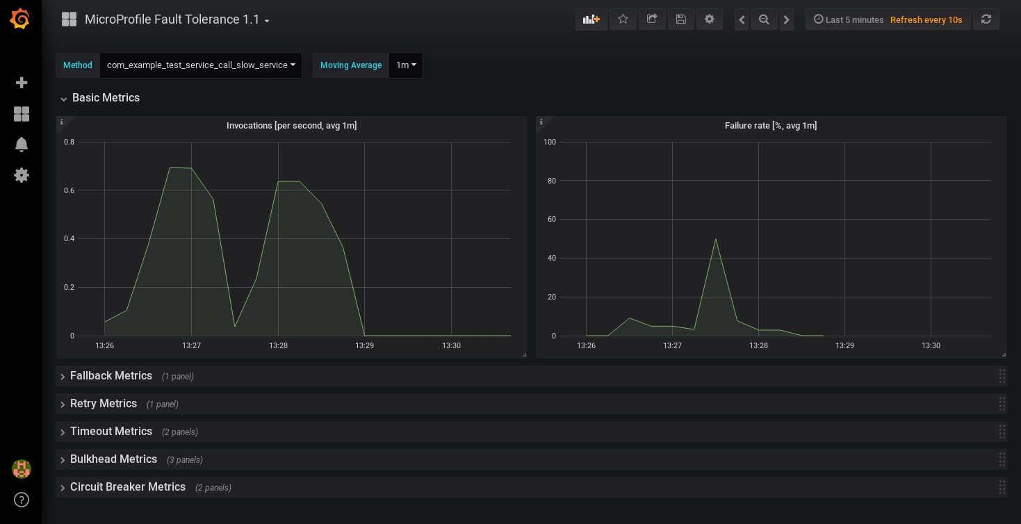
This dashboard shows a selection of graphs for a single method at once. Unless the method is annotated with every Fault Tolerance annotation, some of these graphs won’t apply to that method and will be blank. Since it only shows metrics for a single method, the dashboard isn’t very good for showing an overview of the whole system, but it does let you browse through all the available details when you’re trying to track down the cause of a problem and serves as a useful set of examples for building your own graphs and dashboards.
If you have suggestions for improvements to the dashboard, you can open an issue or PR on github
Creating your own graphs
Let’s take a quick look at how to create your own graphs from the metrics produced by Fault Tolerance. This will allow you to create a graph which isn’t covered in my dashboard, or to extract metrics from several different methods and put them all on the same dashboard.
First, take a look at the Fault Tolerance 1.1 spec to see the metrics which are produced.
For example, here’s the metrics which are produced for methods annotated with @Timeout.
| Name | Type | Unit | Description |
|---|---|---|---|
|
Histogram |
Nanoseconds |
Histogram of execution times for the method |
|
Counter |
None |
The number of times the method timed out |
|
Counter |
None |
The number of times the method completed without timing out |
A little detail on the internals is needed here. These metric names are passed to the MicroProfile Metrics API, which then exports them in a format that Prometheus understands and which conforms to best practise for Prometheus metrics.
The MicroProfile Metrics makes the following changes to the Fault Tolerance metrics when exporting to Prometheus:
-
Metrics are put in the
applicationnamespace -
Dots are replaced with underscores
-
camelCasewords are separated by underscores -
The whole name is converted to lowercase
-
Metrics which measure time are rescaled to so that they’re reported in seconds and
_secondsis appended to the name -
Histogram metrics are split into percentiles, limits, mean and standard deviation
This means that, if you have a method named callSlowService on a class named com.example.TestService which is annotated with @Timeout, the metrics that you can query from Prometheus look like this:
-
application:ft_com_example_test_service_call_slow_service_timeout_execution_duration_seconds
Execution duration percentiles -
application:ft_com_example_test_service_call_slow_service_timeout_execution_duration_min_seconds
Minimum execution duration -
application:ft_com_example_test_service_call_slow_service_timeout_execution_duration_max_seconds
Maximum execution duration -
application:ft_com_example_test_service_call_slow_service_timeout_execution_duration_mean_seconds
Mean execution duration -
application:ft_com_example_test_service_call_slow_service_timeout_execution_duration_stddev_seconds
Standard Deviation of execution durations -
application:ft_com_example_test_service_call_slow_service_timeout_execution_duration_seconds_count
The number of times the method was executed -
application:ft_com_example_test_service_call_slow_service_timeout_calls_timed_out_total
The number of times the method timed out -
application:ft_com_example_test_service_call_slow_service_timeout_calls_not_timed_out_total
The number of times the method completed without timing out
Let’s start creating our graphs.
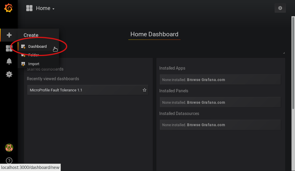
-
In Grafana, first create an empty dashboard:
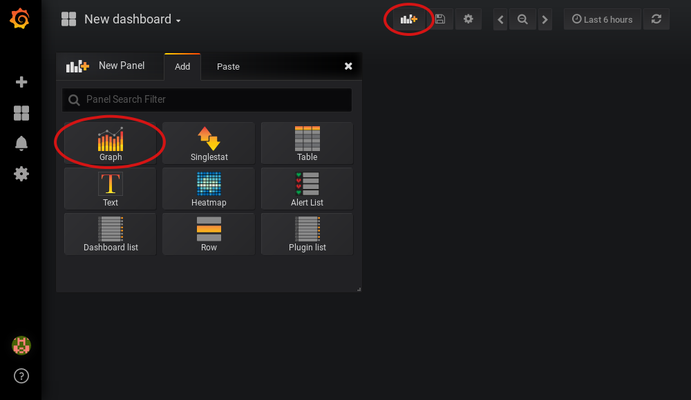
-
Add a new panel and select that the new panel should be a graph:
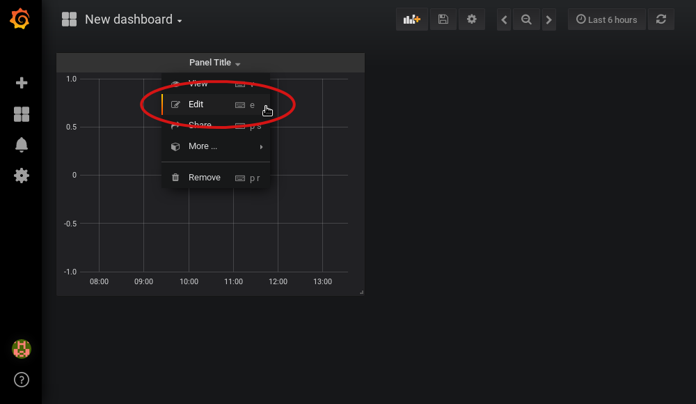
-
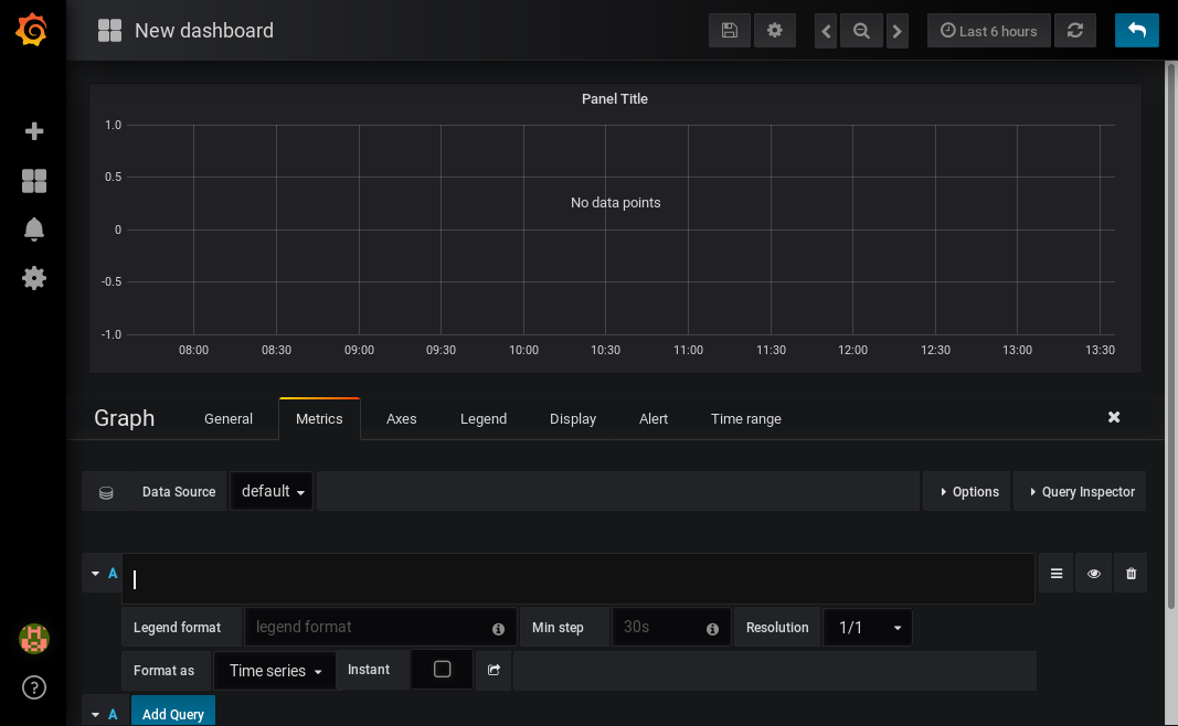
Select edit from the menu that opens in the panel header:
-
Select the metrics tab at the bottom, this is where we write a query using Prometheus Query Language:
Now that we have a new empty graph, let’s start off with a simple example. We can draw a graph of the total number of calls to the callSlowService method.
application:ft_com_example_test_service_call_slow_service_invocations_total
If we load the page a few times to generate some traffic, I get a graph like this:
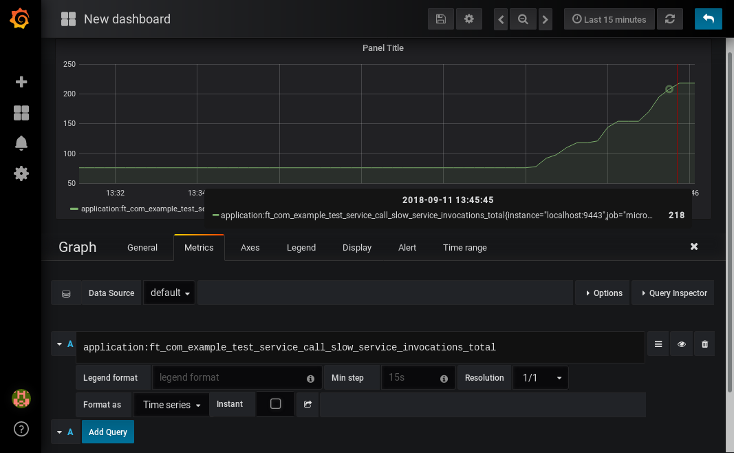
As you can see, it keeps going upward as more requests are served.
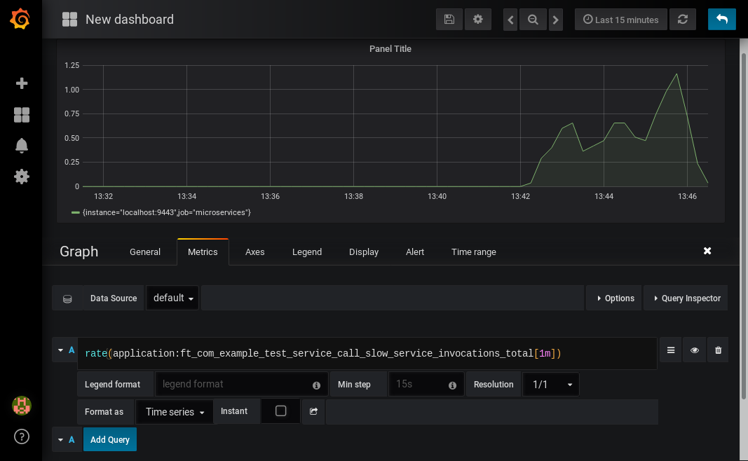
What might be more useful is to graph the rate of requests, which we can do with the rate method:
rate(application:ft_com_example_test_service_call_slow_service_invocations_total[1m])
This shows us how many requests we’re receiving per second by graphing the rate at which the total number of invocations goes up, averaged over the preceding minute:
Most of the metrics produced are simple counters which count up by one every time an event occurs. This is format that prometheus recommends as it’s really lightweight on the server, flexible for graphing and copes gracefully with missing the occasional sample or the server restarting. Prometheus stores the value of the counter at set intervals and can then retrospectively process these samples to produce rates of change, moving averages or ratios. However, the downside of this flexibility is that we need to do a little more work, such as using the rate method, when writing the queries for our graphs.
As a final example, let’s use a more complex query to graph the percentage of calls which timed out, averaged over the last minute. Looking back at at the table above, we see that we have metrics for both the number of calls which timed out, and the number of calls which didn’t. All we need to do is divide the number of calls that timed out by the total number of calls, averaged over the last minute:
rate(application:ft_com_example_test_service_call_slow_service_timeout_calls_timed_out_total[1m]) * 100
/
(
   rate(application:ft_com_example_test_service_call_slow_service_timeout_calls_timed_out_total[1m])
 + rate(application:ft_com_example_test_service_call_slow_service_timeout_calls_not_timed_out_total[1m])
)
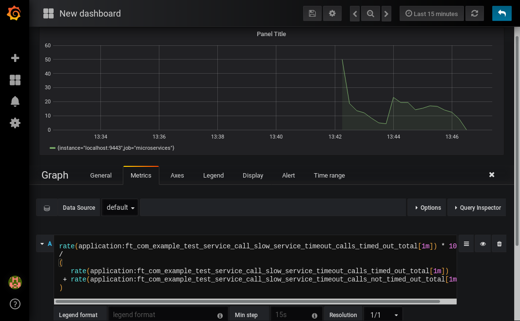
You might wonder why we added together the two metrics rather than using the invocations_total metric we saw earlier. The reason is that if the method was also annotated with @Retry, then each retry attempt would get its own timeout and would be counted towards either the timed_out or not_timed_out metric.
A quick word on alerting
Both Prometheus and Grafana have the ability to create notifications when a metric or a query reaches a certain level. For example, you could create a pager duty alert for the ops team if a critical method is calling its fallback handler more than 10% of the time for more than 5 minutes.
The requirements for alerting are probably slightly different to those used when graphing. For example, if there’s a sudden spike in errors you would want to see that in your graph but you might not want to raise an alert if it immediately settles down again because your automated infrastructure fixed whatever service was broken.
When you’re ready to configure alerts, take a look at the alerting documentation for Prometheus or Grafana to get started.
Conclusion
We’ve seen how the metrics generated by MicroProfile Fault Tolerance 1.1 can be viewed and graphed. We’ve imported a dashboard which allows ad-hoc viewing of metrics for individual methods and have also seen how to combine and use the metrics to create our own graphs and dashboards.


